I really liked this pose that I found in a shoot in ASOS magazine. I want to try it out for my pastel trend. As I want it to look fun and youthful.

I really liked this pose that I found in a shoot in ASOS magazine. I want to try it out for my pastel trend. As I want it to look fun and youthful.
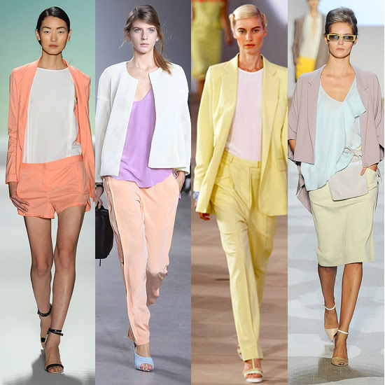
Pastels are featured in ASOS' s summer magazine that I received this morning. A marc jacobs advertisement shows pastel pink jewellery and watches, showing pastels coming in to summer in the way of accessories. There is also a double paged spread on how to wear pastels- mixing them up with matalics and neon colours. There are 4 different looks for differemt occasions 2 casual and 2 for going out. This tips page is really good for advice on how to wear pastels in a different way, mixing trends up and being a bit more adventurous. The last page on pastels shows a mint green pastel colour mixed with stick on gems and pearls- adding girly glamour to any outfit.


 This is my final mood board for my Pastel trend called 'Romantic pastels'. I decided to call the trend romantic pastels because I feel that the pastel trend has been heavily inspired by the 20's where the pastels where usted and 'romantic'. I was inspired by the boards that I looked up and used the images that I liked from my Pinterest board. I used the pictures to create my colour palette, using some muted colours and mixing them with brighter contemporary ones. I feel that the top 3 images explain my trend easily, the left shows a romantic set all in pastel colours, the second showing a range of pastel colours and the last showing how pastels can be interpreted and used for a contemporary outfit. The rest show how pastels are used in lifestyle and beauty- showing that pastels can be used in many aspects of 'fashion' and lifestyle.
 I think that the Pastel trend can be adapted to be suited for all ages. Younger people can use vibrant pastel colours, mix them up and experiment with them. This year pastels have been adapted to hair colour and makeup- this could carry on to next year- and be used by younger people daring enough to try it.